Wednesday, March 26, 2008

week 2-- markers

today i shall be talkign about the wonders of an amazing and not so commonly used art material-- markers!
well wad are markers you ask?
most owuld think of the felt tip kinds we used whe we were kids
permenant markers we use on a daily basis
or even white board markers!

but the markers i am talking about are the super expensive, high quality gift from the gods. ok, maybe not that bad, but they are high quality and really expensive!

to give a breif introduction to markers we can basially find a few brands:

copics
this is a brand most widely used and probably one of the most expensive! it is a japan made product ( the cause of the heafty price tag?) and is my preferred choic of markers!
there are a few versions, mainly, 
copic regular
which is a block like marker

these are good for covering large areas

ciao/ sketch

these are brush tips, this means we are able to simulate the brush strokes with these, i have yet to really see the difference , but sketch is able to hold more ink while ciao holds much less.
top: copic wide-- for extremely large areas i suppose from the looks of that nib
middle ( yellow): regular
below: ciao and sketch note the brush tip!

prismacolors
 from wad i know ( since i never did use it before)
prismas have wide tips like copic regulars. the price should also be considerably cheaper

tria
i have no clue how these are like to be honest!  but they are another common brand of markers!


and well now on to the kind of works one can achieve from these wonderful materials!

first i would like to feature toounit!
toounit is an artist based in malaysia. he is young and talented , and i got into using markers because i got so inspired by his works.
he has since left deviant art and stopped posting his works there, but he would be setting up a website soon and coming to singapore to attend cosfest! ( yay!) and now on to the art!


this is one of the pieces done by him. i love the attention to the details on the girls kimono and umbrella. the shading he has done on her skin and hair is also worth some notations, it may seem simple and easy but trust me it really is not. it requires alot of control of the pen and much practice! although his drawing may be considered as very anime-ish and manga-ish ( and i don't like those kind of styles) i still feel drawn to this artist as i think his works are really beautiful.


Sent From Above by *toounit on deviantART
this piece is bright and cheerful. once again note the attention to the details, every speck of flower plays well with the colour palette. also the blurred and spinning effect he has done in the back ground is worth alot of admiration. it is easy to muddly the colours ( when you try to mix too many colours together) yet he achieved the blurring effect almost effortlessly and this is cause for much more admiration!


Complete Copic Marker tutorial by *toounit on deviantART
here is one of toounits tutorials. he has created many of these tutorials throughout time and this is of very much help to beginners like me. if you wish to view the tutorial you may click on the link and follow the instructions in the comment box.

and now on to another artist!
this time it is mokiyan, aka mindy
she is a young artist around my age. she is extremely talented and i am very much jealous of her talents. haha.
and now onto her marker works!


I Wish... by ~mokiyan on deviantART
as i have stated earlier, it wasnt easy to be able to blend markers so well, yet mindy here has done just that. maybe the anatomy is not spot on, but the idea and composition are extremely well thought through and the skills taken out to colour it must be acknowledged. being able to do so well at such a young age makes me feel like i really need to practice more!


MOKI by ~mokiyan on deviantART
need i say more? i love her drawing style and her colouring! blending and composition is simpel yet nice, subtle details really do play a part! now seriously, i need to practice more!


Happy LATE Halloween by ~mokiyan on deviantART
please don't ask me how she did this, i think when she drew this she was 13 and i am forever going to feel inferior to her talents!
enjoy! please do visit her gallery to view more of her works.

and now time for me to share my experience with markers! 


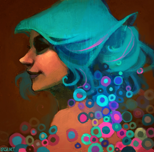
sunny eyes by ~havockid on deviantART

nirvana by toounit by ~havockid on deviantART

friends by ~havockid on deviantART
the above 3 are some of my own marker works. basically they are really nice to use and i have grown extremely fond of them, they are like my little babies!

markers are not easy to control since they are alcohol based, and blending is crucial. if blending is not done well, one would be able to see colour variations due to the overlap of  the same colour. imagine  face with streaks of dark and light skin, not very pretty now is it?

another is that to keep them blended, one must keep the ink wet so that another colour would be soluble in the the colour before hence forming a gradient. it is hard to keep the ink wet since alcohol dries very easily and this then requires you to move fast and work fast to prevent drying and two tones to take place.

i hope everyone has learnt more about markers and enjoyed this post. i hope all would give markers a try despite the hefty price tag!

Thursday, March 13, 2008

week 1-- textures

today instead of looking art art pieces, we would be looking at the unsung heros behind many art pieces!
the wonders of textures!
at this time and day, textures are used not only to describe the kind of canvas we use with painting methods (thick paint, wide brushstrokes) but also can be applied much more in digital art pieces. they are normally used to either bring in texture ( in the common sense, like the roughness and colours) or bring in more details. i am sure there are many other applications of textures, but i am probably not too aware of them! so i shall bring insight and hopefully some examples to how textures are applied!

here we can see one type of textures commonly used, hte kind to bring in more details with a subtle touch!, they can also be used as an overlay of an existing piece if i am not mistaken, but that is seldom seen, and not something i am familiar with.


oct7 by ~masterjinn on deviantART


feb108 by ~masterjinn on deviantART


oct3 by ~masterjinn on deviantART


july2 by ~masterjinn on deviantART

http://resurgere.deviantart.com/art/Package-Vintage-Grunge-2-61726778

such textures are commonly used as backgrounds to add details subtly without too much painstaking work ont he artist's part.
patterns are commonly seen to be used in such manners. there are also some photomanipulators who choose to use such textures and apply them on other images, probably adding patterns to a at first plain red dress.

then there are the more common textures we are more familiar with such as

Stoned by *bean-stock on deviantART
rocks?

Texture_94 by *iamjett on deviantART
clothe?

these are probably not as commonly used as they are very complex, and must be used very carefully, or with much purpose, or it is possible the texture may over power the art itself.

below i shall show some art pieces who have utilised textures!
a good example is loish's work, which is very textured ( we can see this from the previous post!)


idk either by ~kaarme on deviantART
this piece is a rather simple sketch, yet by placing an appropriate texture on the back, it brings a new touch to the whole piece.


Evangeline Lilly graphic by ~nety-green on deviantART
this piece is a rather "classic" photomanipulation, there are many versions of such types of photomanipulations, all very good examples of usage of textures!


IDMI promo art by ~havockid on deviantART
my own go at using textures! i think it worked out really well since i had alot of trouble trying to get a nice background until i used the texture, and bam everything became much more interesting!
the texture used can be found here: http://resurgere.deviantart.com/art/abstract-experimental-vol-3-17948236

same textures, more work!

acid house by ~PYFF on deviantART

i hope all have learnt much more about textures! they really are a wonderful tool that should never be overlooked. textures save lives :D

week 10- loish


today i shall be doing a feature on the wonderfully talented loish!
shes 22 and lives in holland. her art work is distinct by the hues she commonly uses. he cyan blues and browns.
another distinct feature is her use of textures to create a vintage and worn down look on her art.
without further ado, we shall explore her art, like they say a picture says a thousand words.


i especially like this piece alot, its very distinct of loish's style. the colours used are mostly a dull greyish colour, yet there is a distinct outline on the figures. the colour choice is amazing as the green hair brings out the redness in the skin of the girl. the fish also have a metallic shiny look to them, this reflects the light from the cigerette bud and her hair. the figure is also drawn in a semi realistic style, as opposed to the normal sharp chin, stick fingers and arms with huge anime eyes, this girl has realistic body proportions which are stylised to make them more interesting. the expression on the girl's face is also very playful. the details placed into this is subtle yet makes up the pictures greatness. the background may look simple, but is made up of many textures and colour gradients. the grey background is not a still grey but many shades of subtle grey which enhances the image. the texture used in the "circle" should also be noted. this brings about small details which are not eye jarring but makes the picture more interesting. take note of the texture as we would discuss more about them in the future.


i lied... by `loish on deviantART
another piece from loish. this time in a slightly more different style than before.
this time the subject is ariel from the classic disney movie "the little mermaid" here we can see the brush stokes are not polished and the colours have a certain acidity to them. do note that the colour scheme is still some what similar with the green-blue and brown-reds. the sketchiness of the piece is brought out even more with the texture she used over the whole piece. these is also a dirty look to the piece like it was crumpled and rubbed with scabbed paint. ( maybe like a painting that is worn out on the wall?) this is an interesting texture.


this piece was done in a hurry, just a quick sketch, yet it is one of the pieces i really like from her! there is once again a vintage look about the piece, with the rough textures and funky patterns. lets not forget the acidic blue once again!
the expression is rather hidden with the shadows, but is visible, it really has this worn off look to it!

more work from loish, but i'll let the picture do the talking!


for more works do view her site:http://www.loish.net/fishes/
or her deviant art account: www.loish.deviantart.com